Film of the Month
Over at the Inglorious Leica Lovers group we have started a Film of the Month initiative. We created a shared Google Doc in which we keep track of all the emulsions the crew is interested in. In an effort to keep from shooting a disproportionate amount of color or black and white film, we are alternating between the two. And the first film that was selected was Fujifilm Acros II. I was skeptical. As a lover of all things Fujifilm, I cut my teeth on FujiColor 200 back in 2020. So Fuji is definitely near and dear to my heart. But knowing that Fujifilm has taken to repackaging films left me wondering who really made this emulsion. I was frustrated when I discovered that Ilford had made this. Now, I love the look of various Ilford films, specifically Delta, but I have had such bad luck with their films - issues with loading, advancing, tearing, at an alarmingly high rate - that saying I was skeptical is being nice about the whole thing. However, it seemed that Ilford used Fuji's specifications for this and did not just repackage any of their own films. I'm still unsure about that, but I did like the results. Kind of.
Contrast, or lack there of
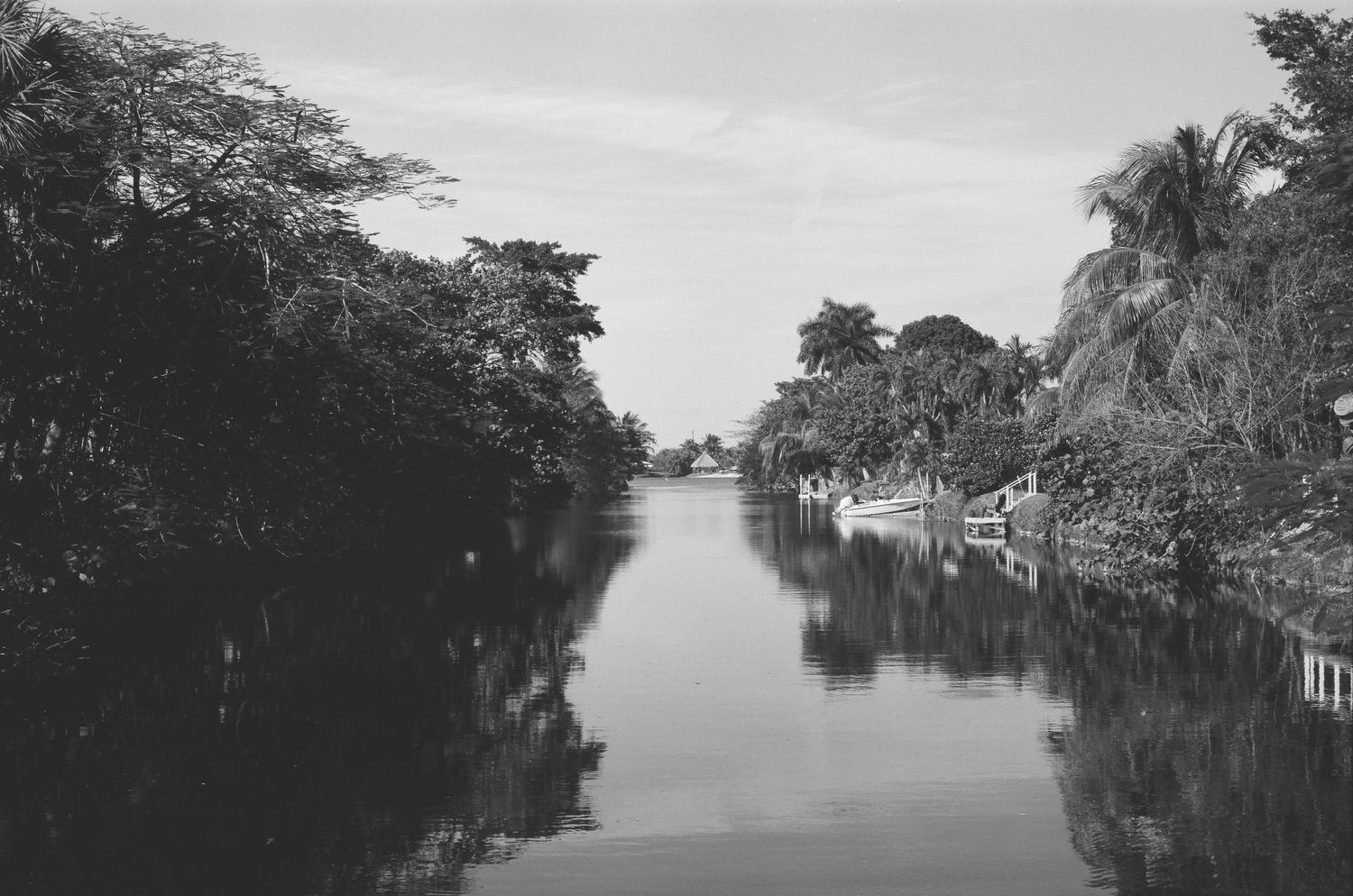
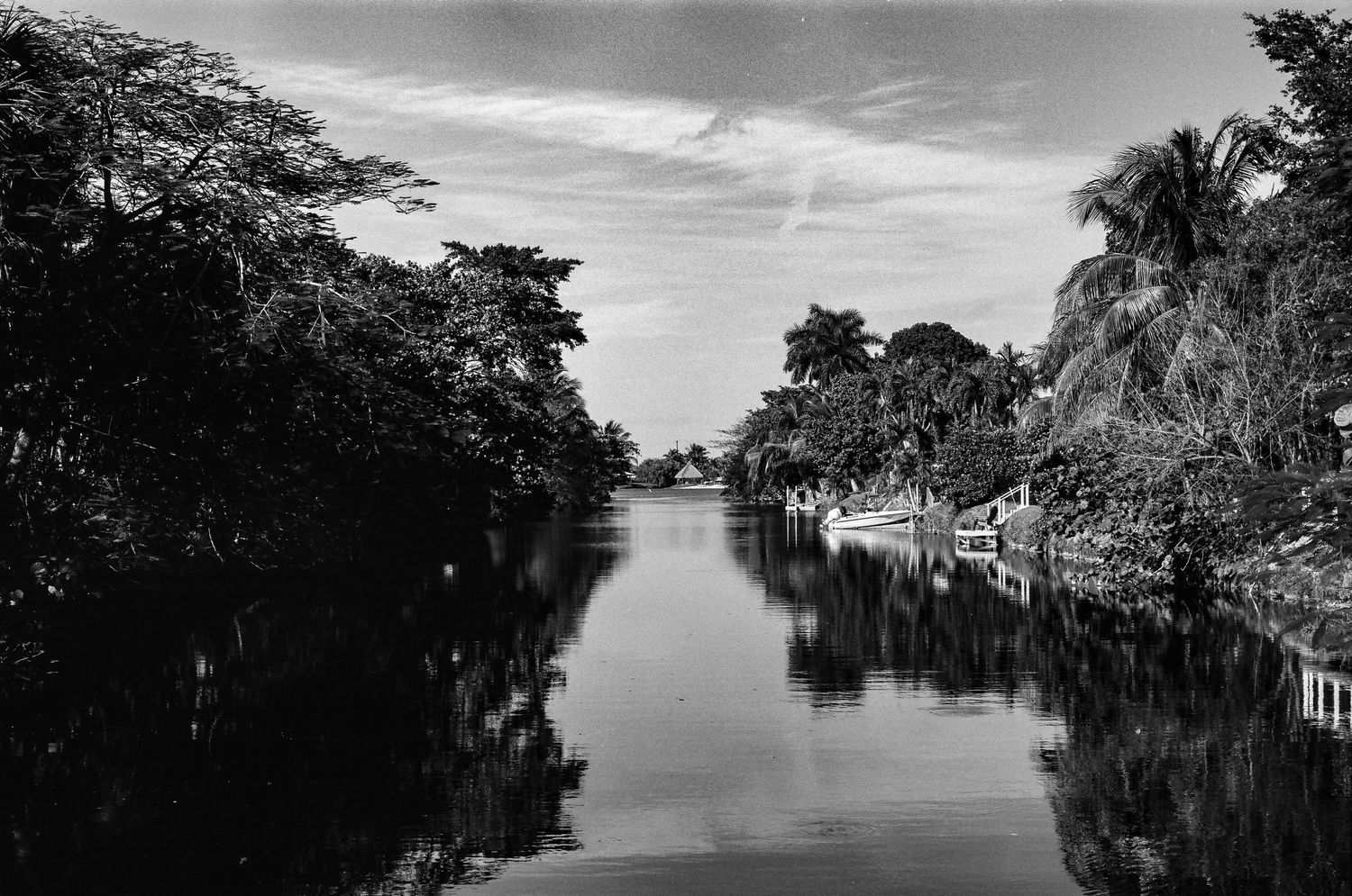
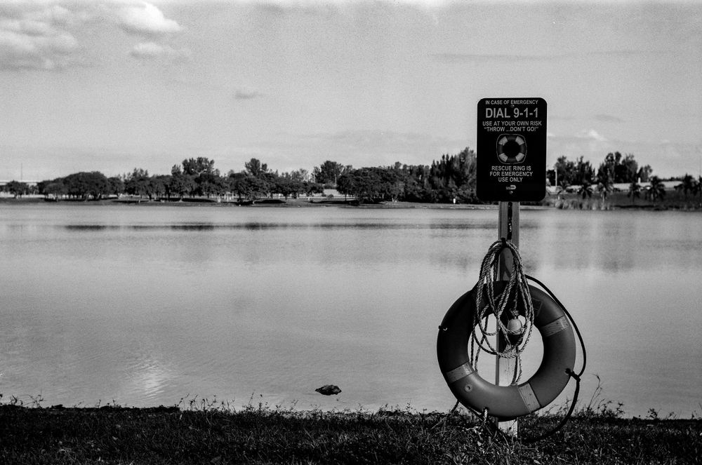
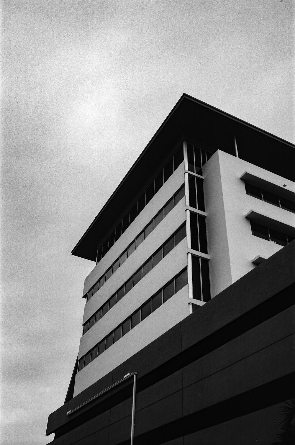
I like heavy contrast in my black and white film. In fact, when I shoot black and white film, that is what I look for in my compositions. For me, that's where the visual interest comes from in black and white photography. So, I was disappointed by the level of contrast I found in these photos.
This photograph is a scan that I got back from Palm Film Lab, with whom I have always been delighted with their scans. I am not sure who does the scanning at Palm, but they always deliver gorgeous looking scans. And this is no different, I just don't like the low contrast inherent in Acros. The level of detail I usually like in my skies is gone. I love to have well defined clouds. I also love inky blacks and bright whites, which I think is absent from these scans.
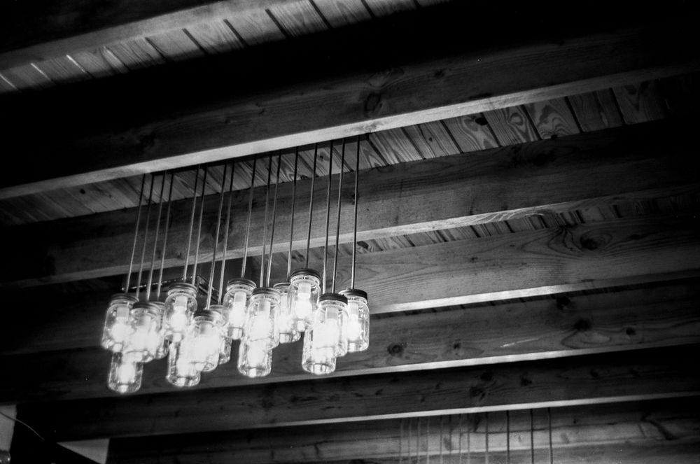
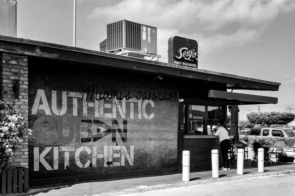
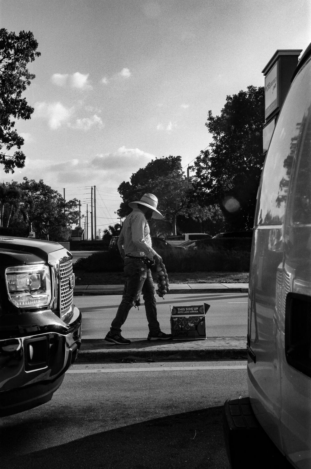
Once I edited the scan, I really liked what I got. The grain became more pronounced, so if I was looking for fine grain with this - as I imagine most would, choosing a 100 speed film - this would not be the best choice for editing this film. However, I do really like the tones. Because there seems to be a high dynamic range here, all the tones between black and white are easily identifiable here. For something like a landscape, cityscape, or general street photography, this might be a great choice.
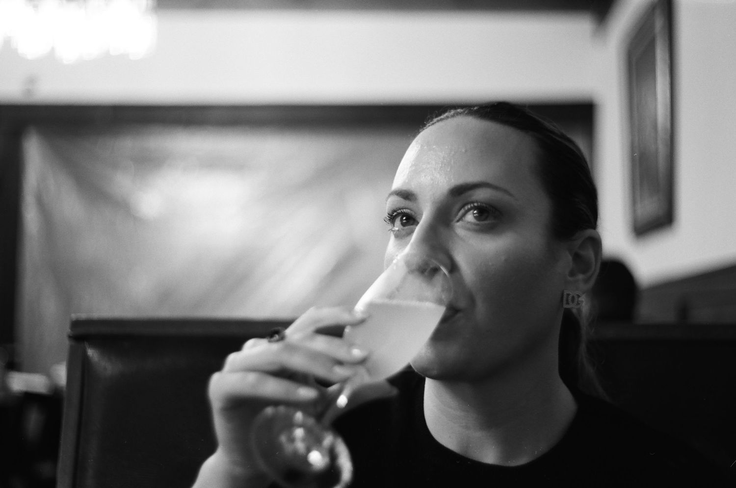
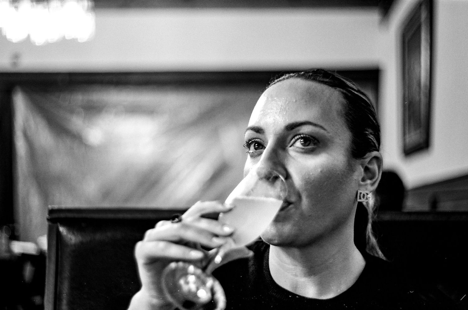
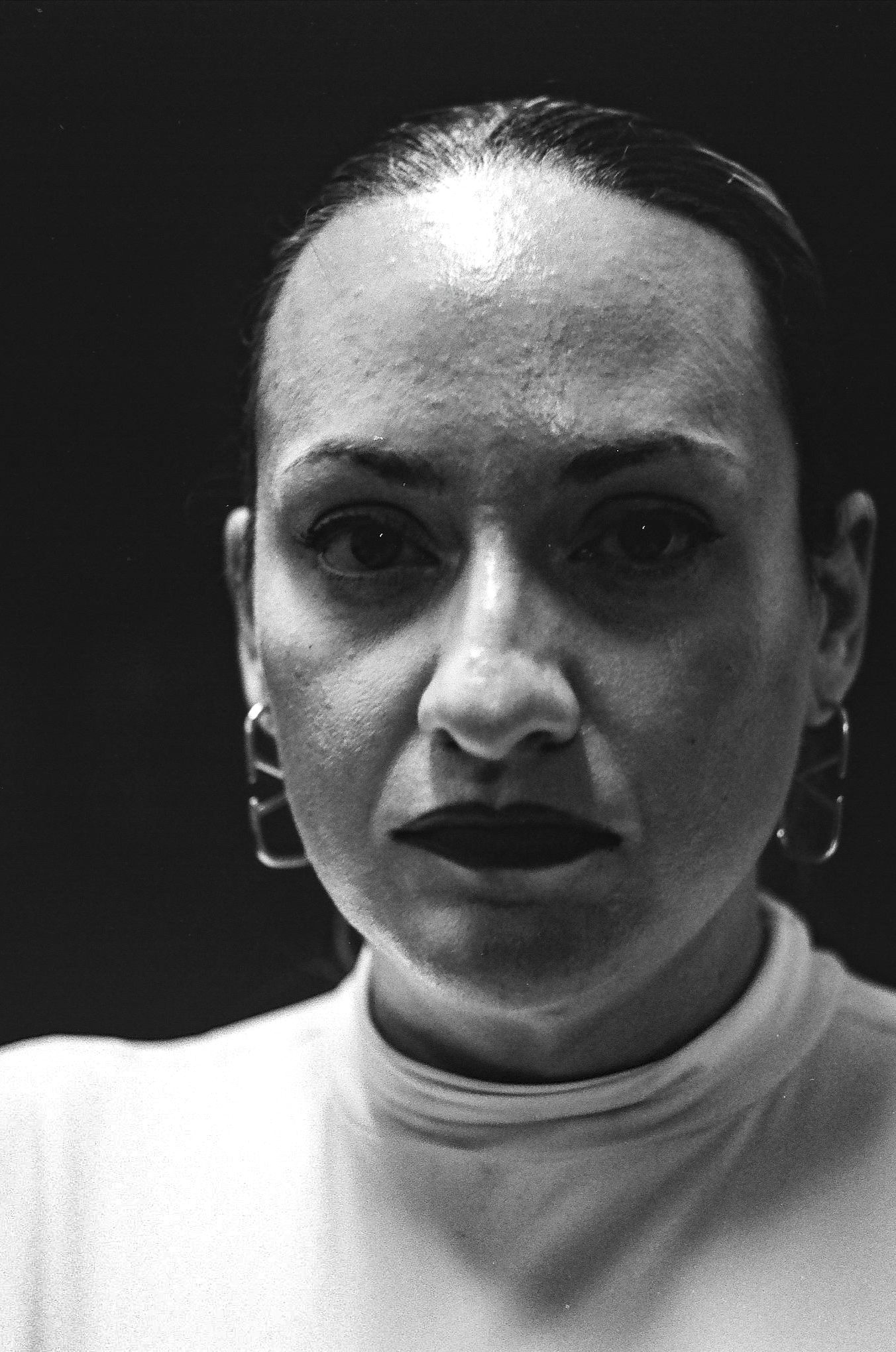
For portraits, however, this low contrast does work nicely. Here are two versions of the same portrait. This first, like before, is the scan direct from the lab, and the second is my Lightroom preset. I think somewhere in between these lies the best version of this portrait. The skin tones are beautiful with this. And as I write this and look at these, I think I prefer the unedited scan to my edit, which upped the contrast the same amount as the landscape above. Versus my favorite black and white film, Kodak Tri-X, I think this is the better choice for portraits. However, I think that might edge our Tri-X only marginally.
I think a lot of this contrast issue that I have can be mitigated with an orange or even red filter. These were made with my Leica M3 and Summitar 50mm f2. That lens has a non-standard filter size, so I never shoot it with any filters. However, if I shoot this again, I will likely go with another lens and use an orange filter. This might increase the contrast just enough to not bother me. Regardless, with the ease of editing scans with Adobe Lightroom, it really isn't much of a bother at all.
Tones
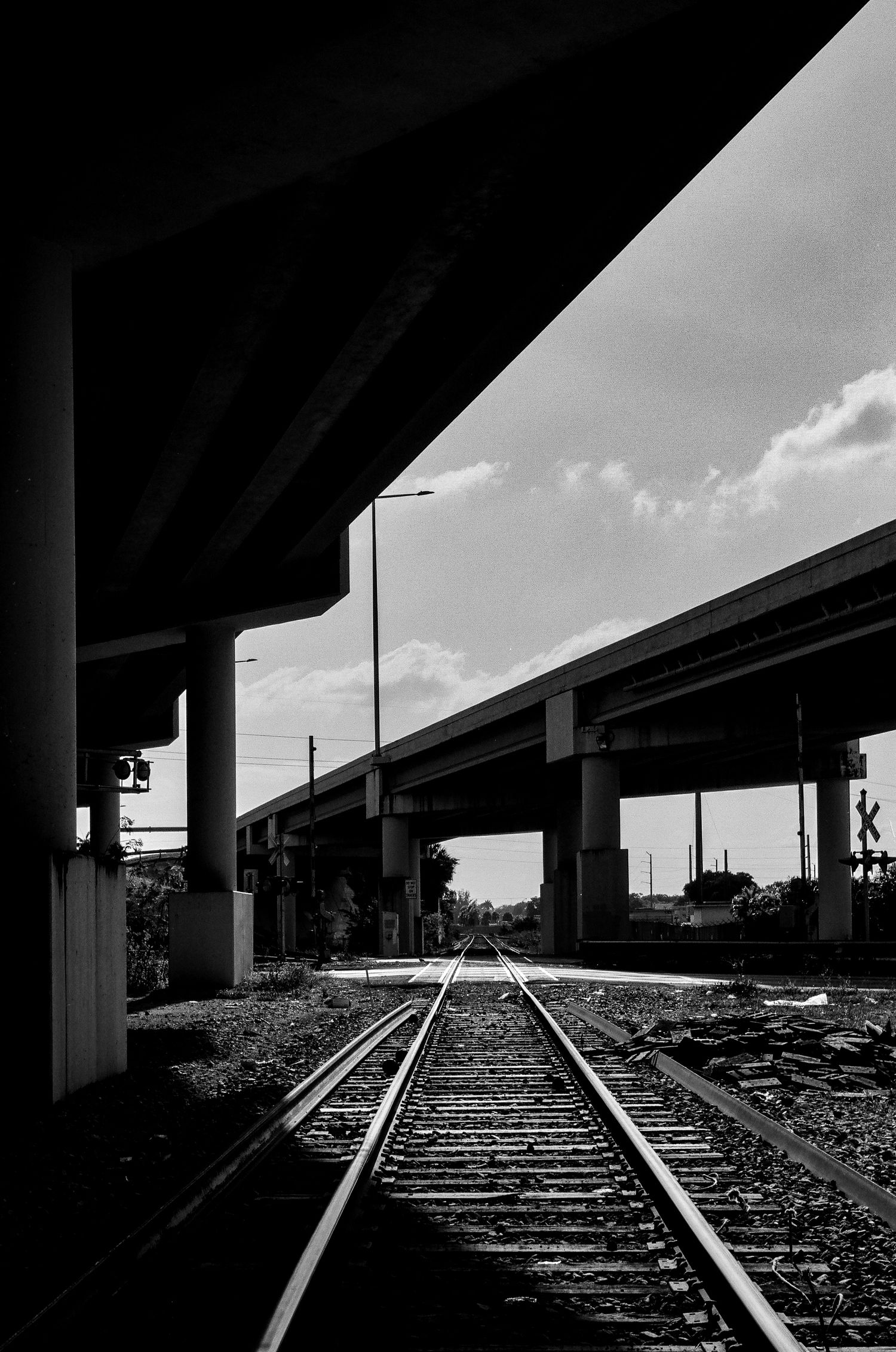
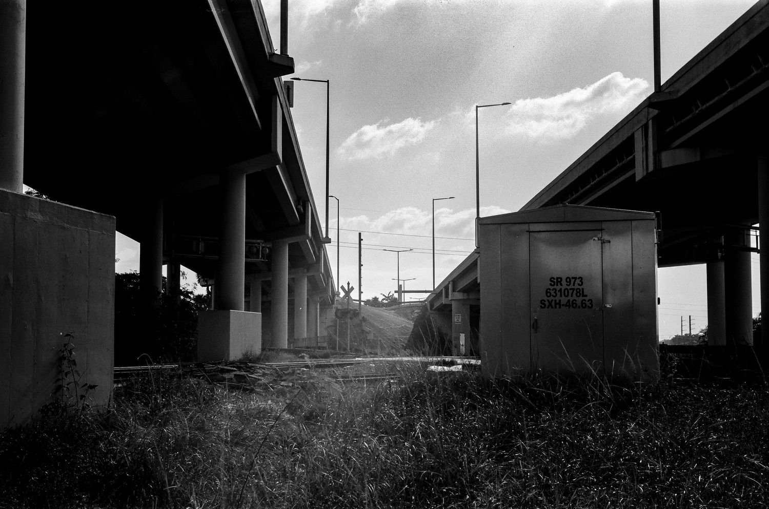
This is where Acros really shines for me. The dynamic range is great and its rendering of monochromatic tones is fantastic. Some films have nice, dark blacks and bright whites, but no range in between them. Once I upped the contrast here, I found a range of tones that I really, really, liked. This bridge scene at a railroad crossing is a perfect example of this.
The shadows here are brooding and ominous. The areas where the sunlight falls directly glow beautifully. With very little editing, I was able to bring out incredible detail in the sky, ground, and shed. The ray of light that shines down from the sun hits the ground and blooms beautifully. This was one of the scenes I enjoyed most in the shooting of this roll. I found this setting incredibly serene and peaceful. And despite the rubble on the floor and the general industrial backdrop, quite beautiful and photographic.
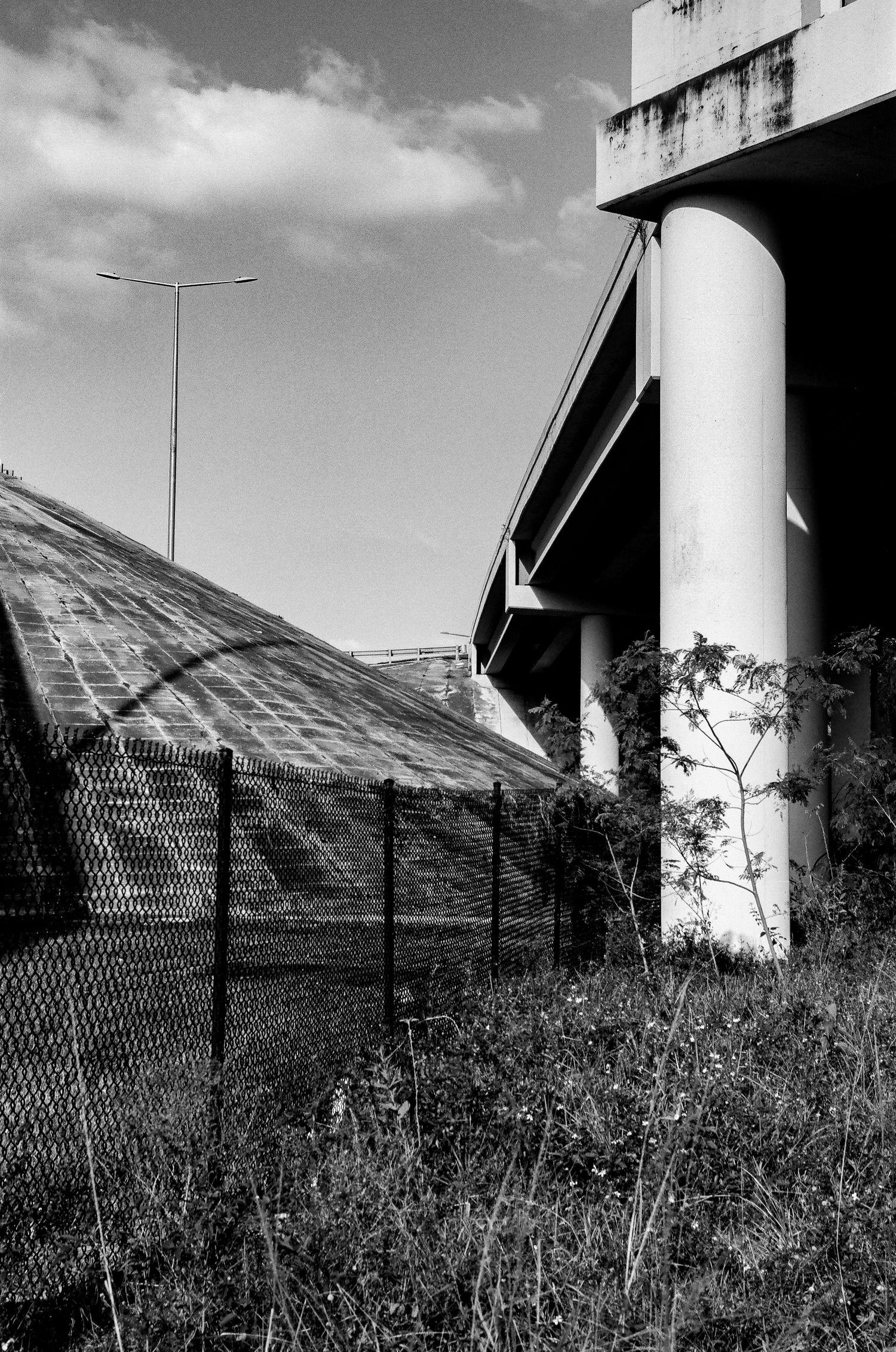
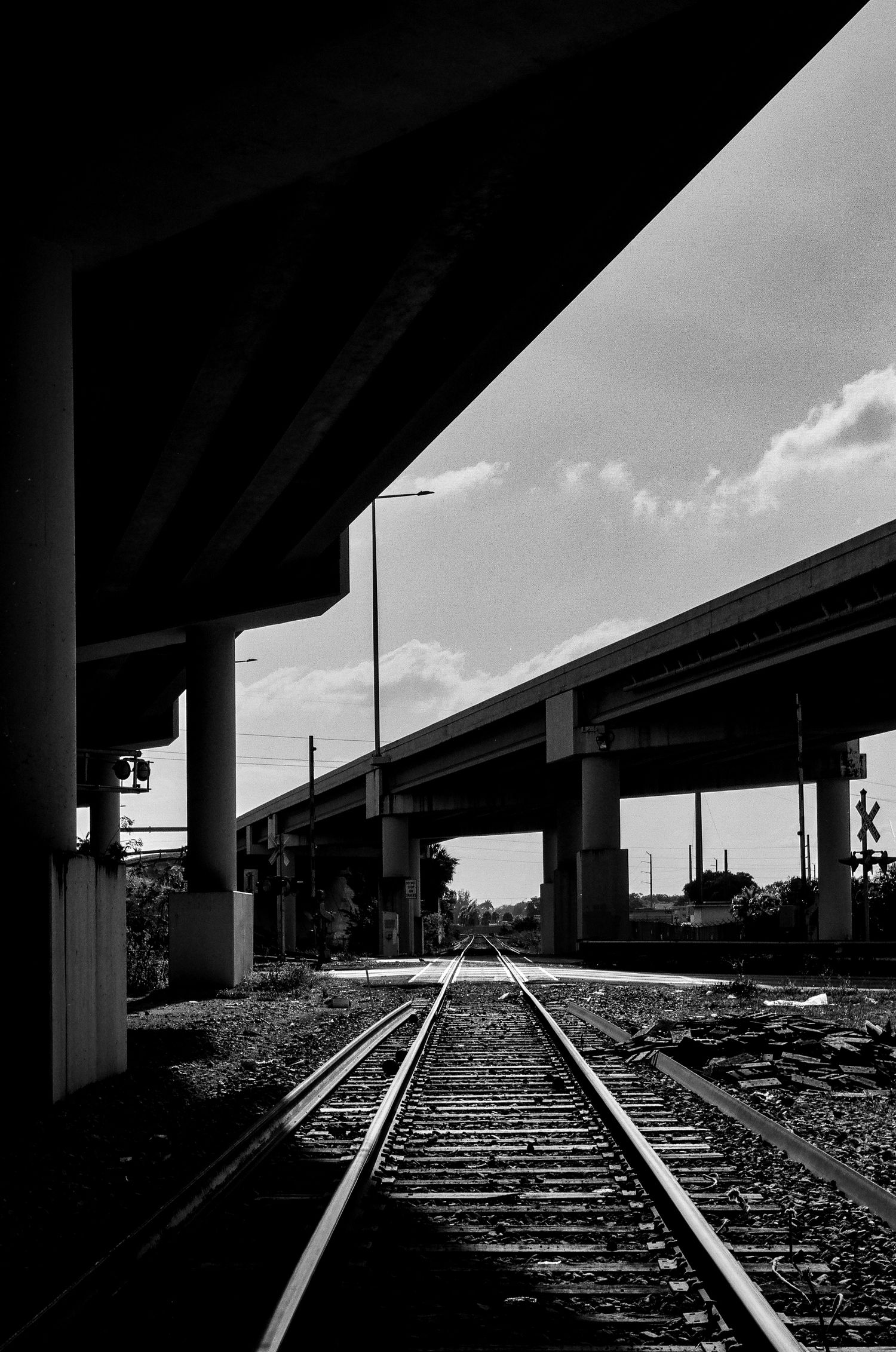
On some level railroads have always spoken to me. Photographically, of course, there's the leading lines and geometric shapes. Much like architectural photography, these basic and primal qualities make for pleasing and interesting photographs. But on a more subtle and analytical level, railroads have also spoken to me. The idea of riding the rails, whether for the purpose of traveling for leisure or freight-hopping, is a romantic one. Trains and railroads are from a bygone era, yet still relevant today. That alone makes it a perfect pairing with film photography, another concept from a bygone era, yet still relevant today. Regardless of the reason, I find railroads, crossings, and trains inspiring.
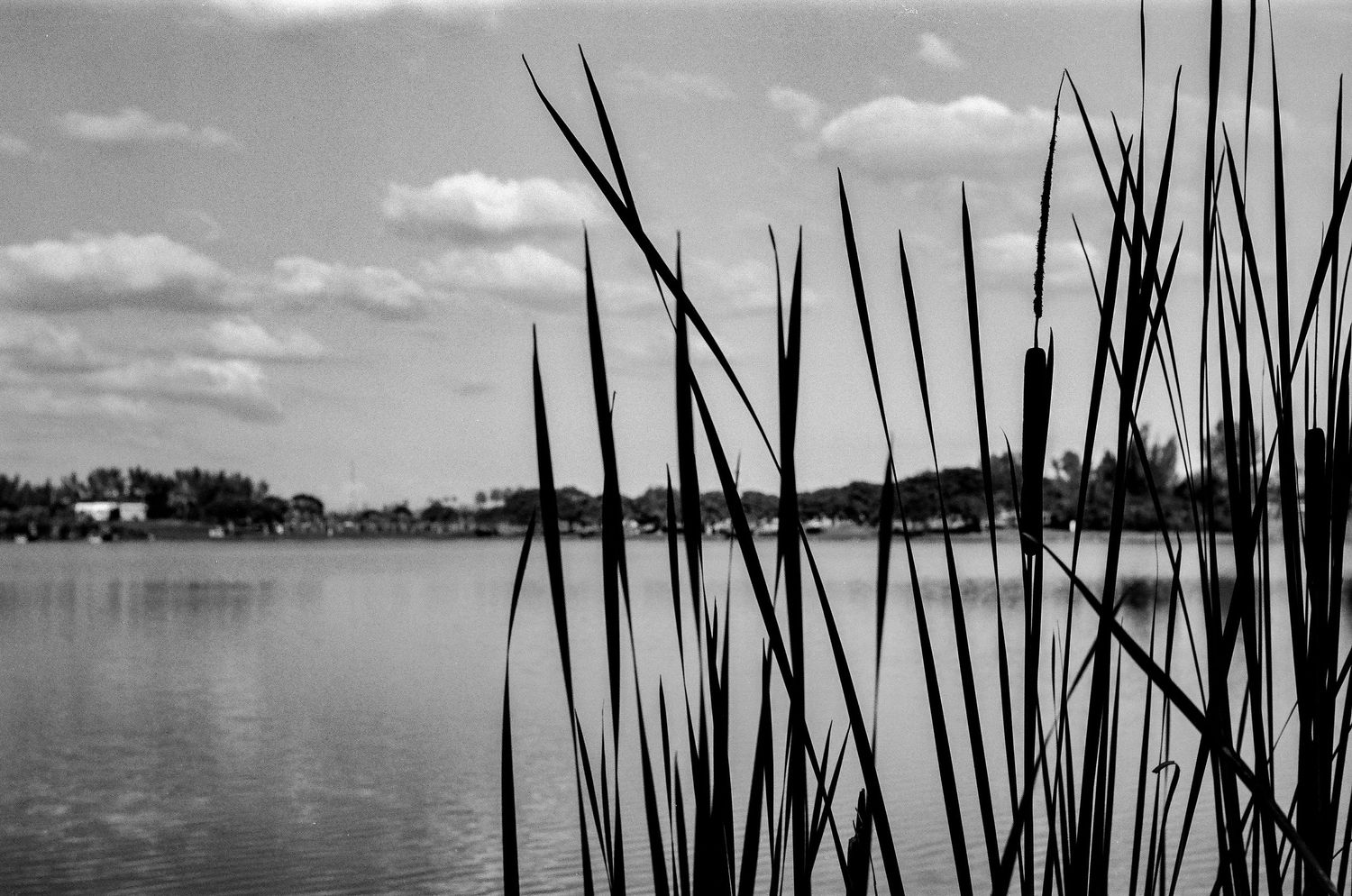
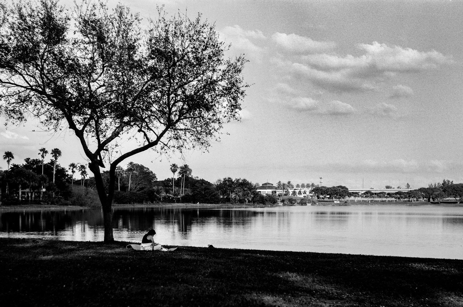
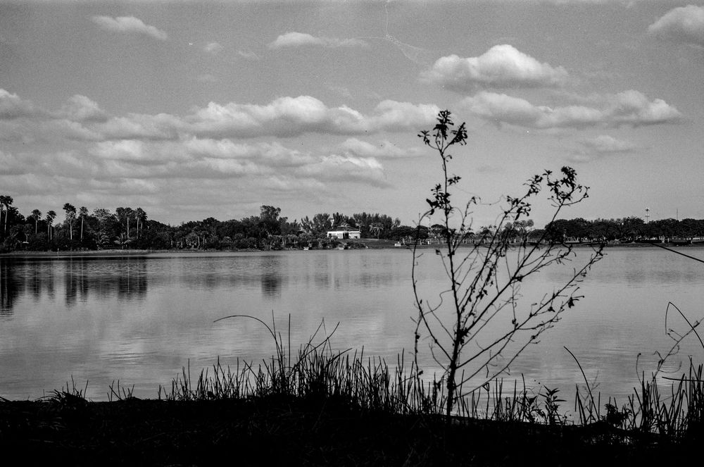
Not wanting to limit myself to railroad tracks with this roll, I decided I would use this roll as an opportunity to visit some standout places in Westchester. I next visited Tropical Park and made this landscape using some cattail grass as foreground. I was happy with the scan, but once I applied my Acros II preset I found I really loved this photo. The silhouette created by the cattail against the landscape of Tropical Park really works for me. I made a second photo a moment after this with the focus racked onto the landscape and found that I preferred this one much more.
There's something incredibly "Florida" about this photo. Cattail is found all over the world, but something about the sky and the lake gives me a feel of being in the Everglades. Of course, prior to the development and western expansion of Miami, this was all Everglades swamp land.
Whatever the reason, I really enjoyed the process of shooting this roll. The decision to make these exposures at places devoid of the usual hustle and bustle of Miami street photography I usually make I think was a great one. This was something else. This was calming, centering, and enjoyable.
It has brought about a desire to make more landscapes and cityscapes. I'd love to try this process again with some color negative films, or even slide film. As of yet, I have not shot any slides in Miami. Loving my hometown and slide film so much, that might seem odd. Maybe I should rectify that soon. Regardless, I think the best way to enjoy Acros II at box speed is by significantly upping the contrast and dropping the black point. The final result is one I like very much.
Pushing Acros II
About two weeks went by between the time that I shot that first roll of Acros and the second. I decided for the second that I would push it two stops to see how it handled the push in dynamic range.
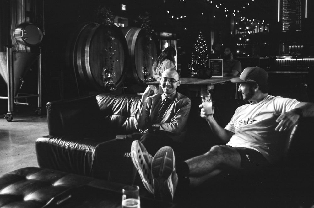
Where the first roll was loaded into my M3 and Summitar 50mm f2, these were made with my Leicaflex SL and an assortment of Leica R lenses. This one in particular was made with the Elmarit 35mm f2.8, which has become my favorite R lens. It is so sharp and provides a gorgeous focus falloff and beautiful contrast.
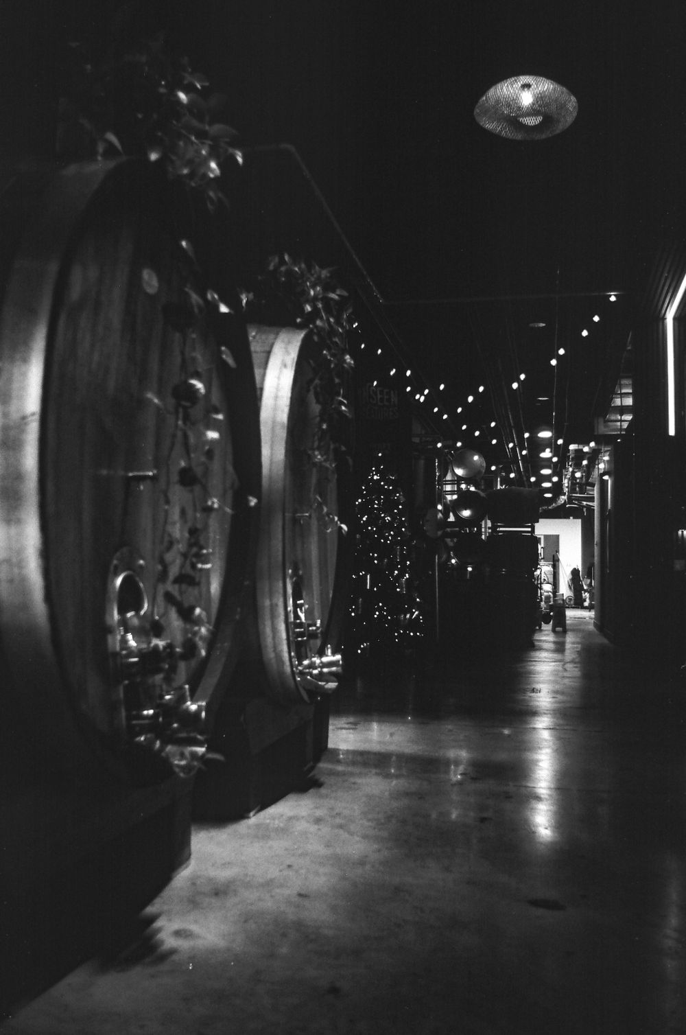
What I first noticed is that pushing increased the contrast and grain, which is pretty standard. But it increased the contrast and grain to a point where I almost needed to do no editing at all with these. I did drop the black point slightly, but otherwise these are untouched.
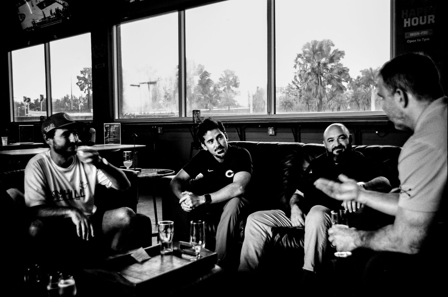
This was after the end of a long, long week at work. We teachers find any excuse to have a happy hour. Or maybe that's just the culture at my school? What I do know, is that I work with an amazing group of educators that I call friends. And we waste no time in throwing back a few cold ones and lighting up a stogie or two.
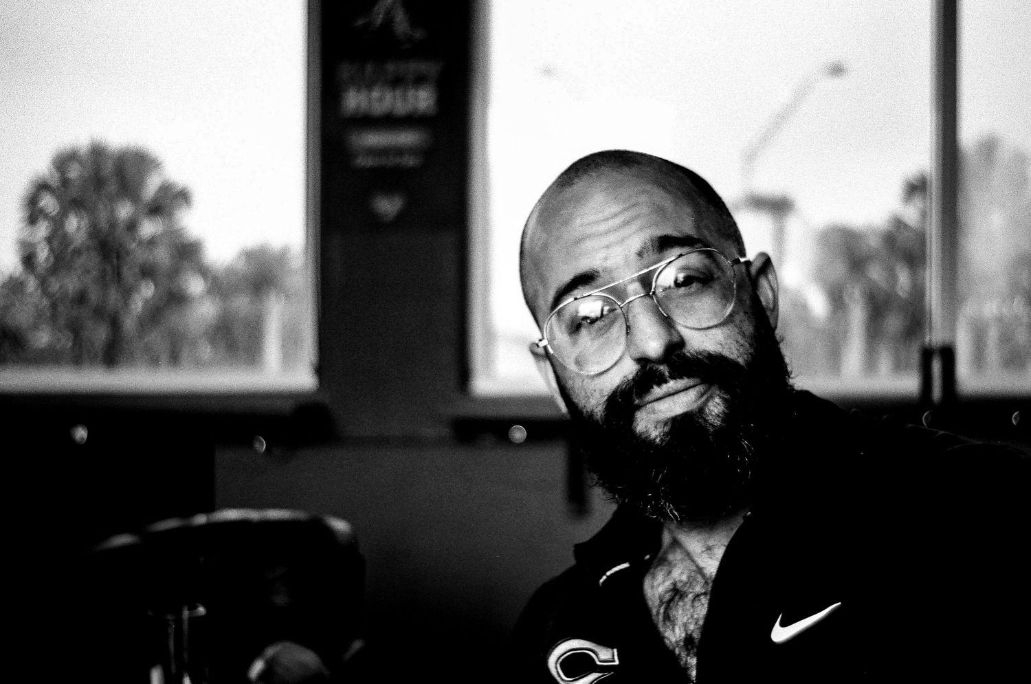
That first one, and this portrait, show Acros' strong points when pushed. With the right light, the contrast is lovely. I actually really, really like these. This portrait of Chris, our art teacher and a fellow musician, has exactly the sort of contrast I like in my monochromatic photos. And the Elmarit 35 is a great portrait lens too. It allows me to make these sort of 1/3 body portraits that I love so much, while including a bit of background for context.
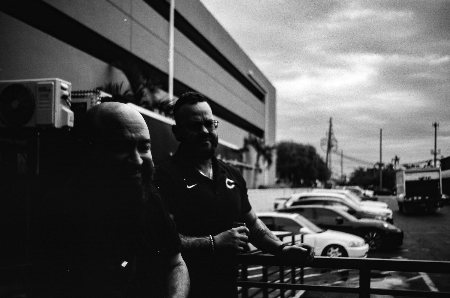

When pushed, though, it fails to recover any information from backlit situations. My guess is that 400 is pushing the limits of Acros' dynamic range. Because I metered these for shows. I may have had a few brews, but I remember thinking, "Now, Dave, these are backlit so overexpose these by at least a stop." My internal light meter is quite accurate and I know these subjects should be exposed properly. Acros simply doesn't have it in it. So, a limit? Certainly. But that doesn't take away from the fact that I actually prefer the rendering of the pushed Acros. It is better looking, in my opinion. But, oddly, as great looking as it is, it's harder to get balanced exposures than even slide ilm.
Final Focus
So, what do I ultimately think of Acros?
I like it. I even like it a lot.
I really like how it works for portraits. I love the range of tones that are present when shot at box speed, but I dislike the low contrast.
I really like the contrast when pushed, but I dislike the amount of information lost when backlighting is present.
Ultimately, Acros is a mixed bag. Do I like it? Yes. Enough to shoot it again? I don't think so. I simply cannot see myself ever reaching for this over something like Tri-X even if only for pure consistency. It is why I won't change to Ilford Delta for my all-purpose black and white.
When can I see myself using Acros? Portraits. That's about it. If you are a portrait film shooter (are there any of those still left?) that needs to shoot in black and white (even rarer, I would imagine) then this is your film.
I can also see this as the film of choice for someone who doesn't like high contrast black and white, but enjoys a high dynamic range. But for me? No thanks.
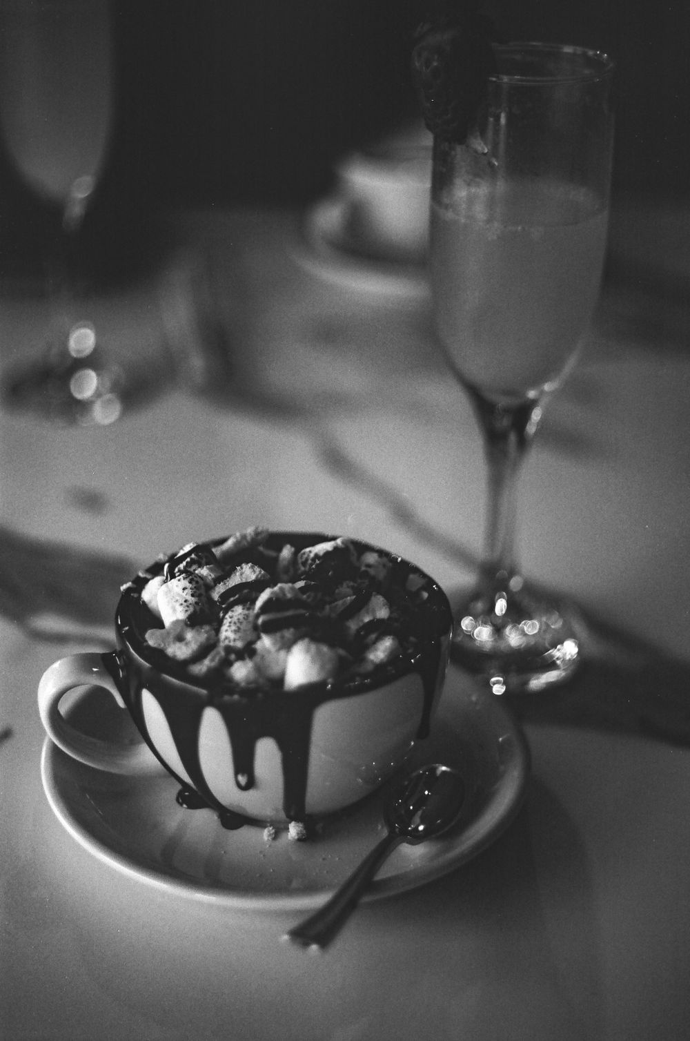
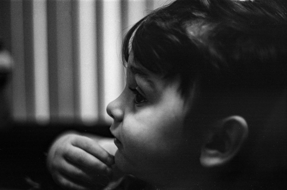
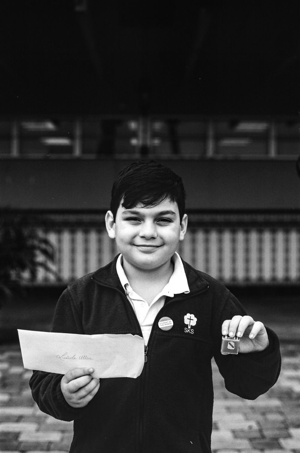
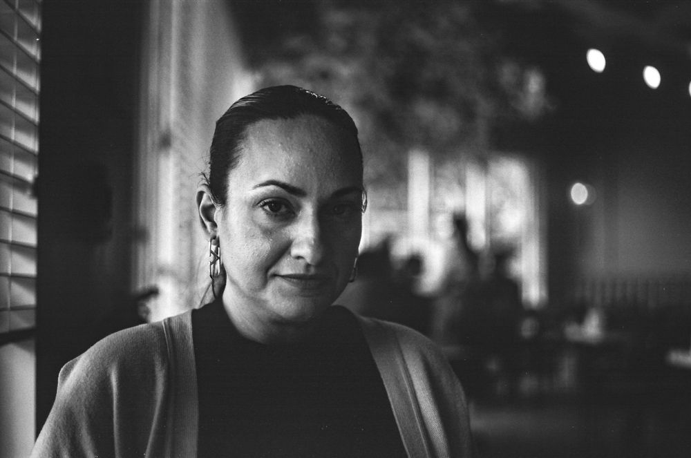
More Fujifilm Acros II

All images © 2020-2025 David Ulloa Studio. All rights reserved.