Budget Professional
Kodak offers films in two grades: professional and consumer. Within those two worlds you will find some variety with speed and color rendering and such. But generally speaking there are two areas that photographers accept as "where the money goes" when it comes to Kodak Professional films and those are grain and color. Depending on the kind of photography that the person is doing, what colors they look for will change, but many view the varieties of Portra as superior for its pastel color palette and excellent skin tone rendering while others view Ektar as the superior for landscapes and wildlife. The odd film out is Pro Image. In fact, it is so infrequently discussed among the analog crowd that I had no idea what I was looking at when I saw it on sale. Was this some knock off Kodak emulsion or some long expired film that was unpopular even before the CCD sensor took off? A quick search on the ol' Google machine informed me that it was, in fact, from Kodak's Professional range and still very much in production today.
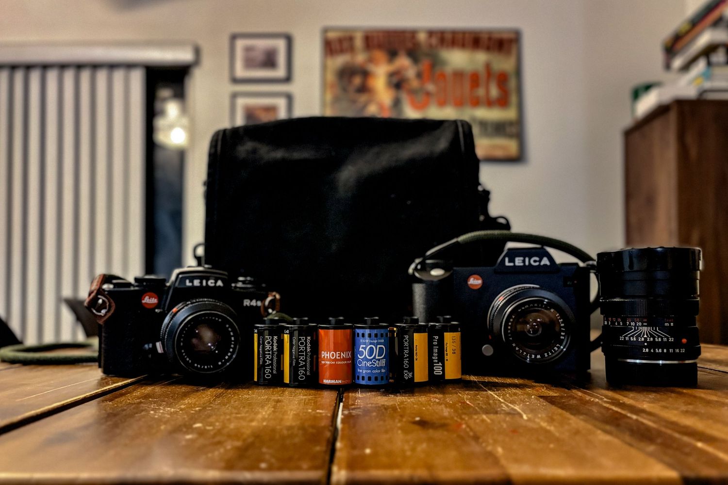
Fast forward a few weeks and we were headed out on a Caribbean cruise. As I usually do before a trip, I packed my bag with a film and a digital camera. While I ended up downsizing the number of rolls I took, I ended up with one roll of CineStill 50D, one of Harman Phoenix 200, one of Kodak Portra 160, and one of Kodak Pro Image 100. When I posted this to social media I was promptly told that the Pro Image was out of place with the others, being a budget film. This was news to me as Kodak's nomenclature and branding puts this firmly in their Professional line. But was this why no one ever speaks about Pro Image? Was this why it was on sale? Should I leave it behind and use it as a test roll?
I opted to take it with me and reserved it for the first full day on the cruise, deciding to stick with my digital SL for boarding day. Obviously, when shooting a roll of film for the first time, you've got no idea what you'll get. But I was excited to see what would turn out. Well, I can confidently say that few are the times I have been more pleasantly surprised.
Seeing Clearly
The day started out early. I got up and dressed for sunrise yoga. By the time I got back to the room, Steph was getting ready for one of her Hot Girl walks. I still don't understand how this is different from a morning constitutional, but the marketing and branding department has won out, I guess. I grabbed my R4s and Summicron 50 before we made our way to the top deck of the Virgin Valiant Lady to work up an appetite for breakfast.
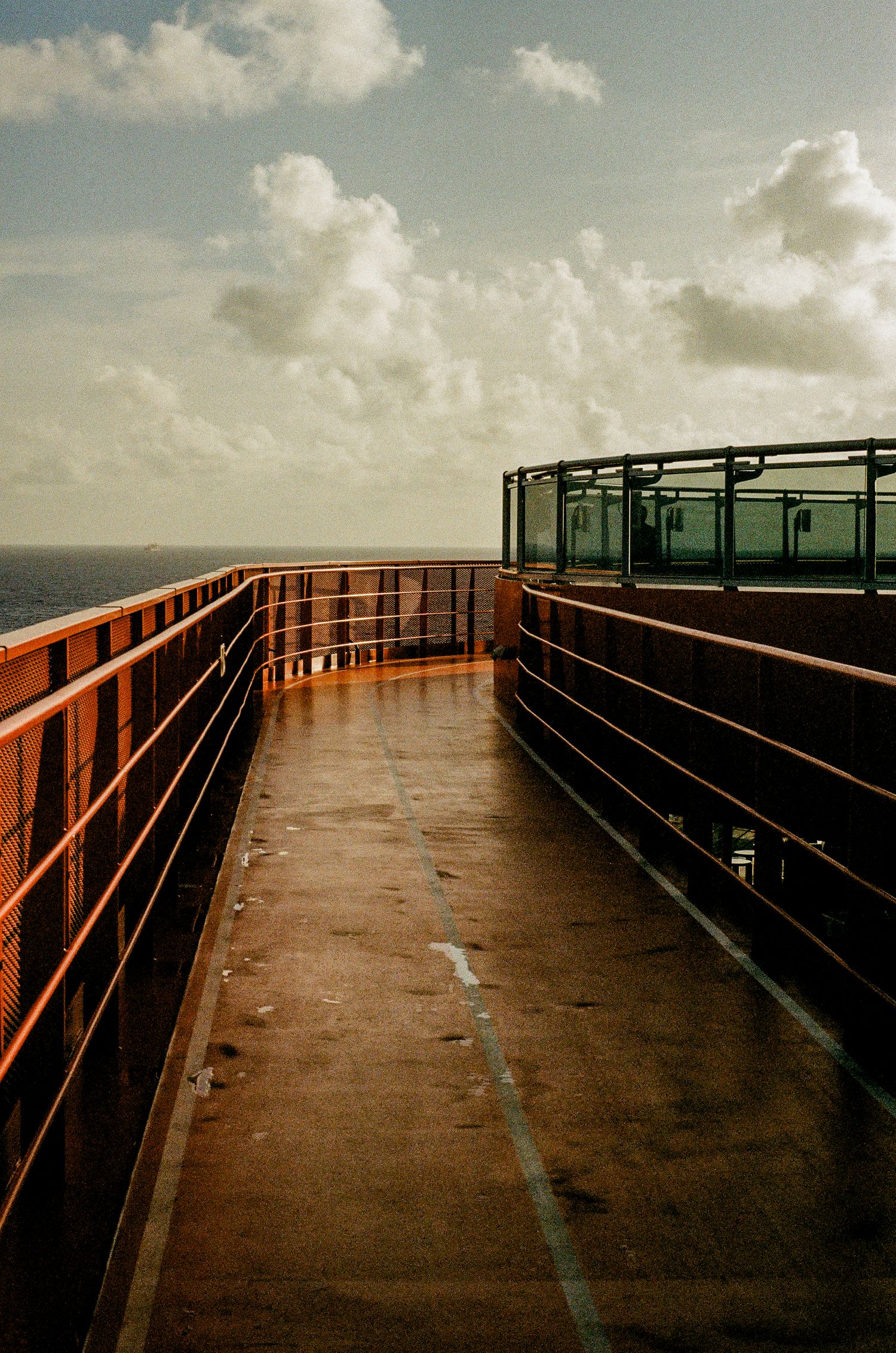
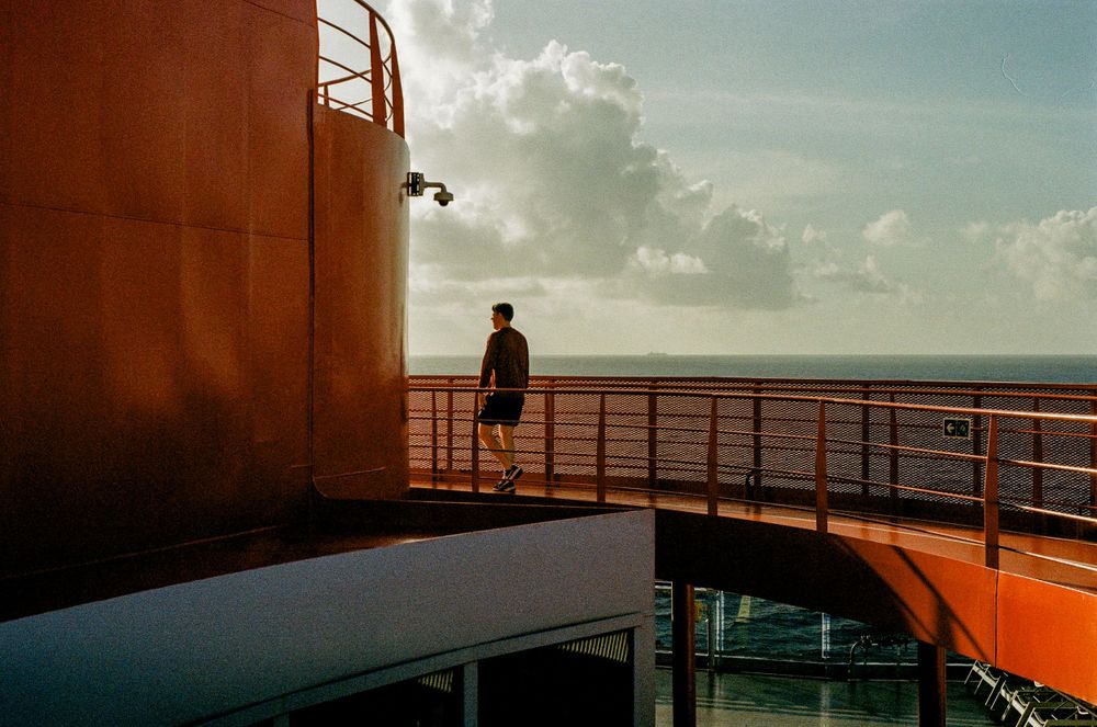
The sun had had already risen over the horizon and was giving off just enough light to paint the vista with gorgeous hues of blue. When the red of the tower viewer pierced the ocean I knew I had found a composition worth releasing the shutter for.
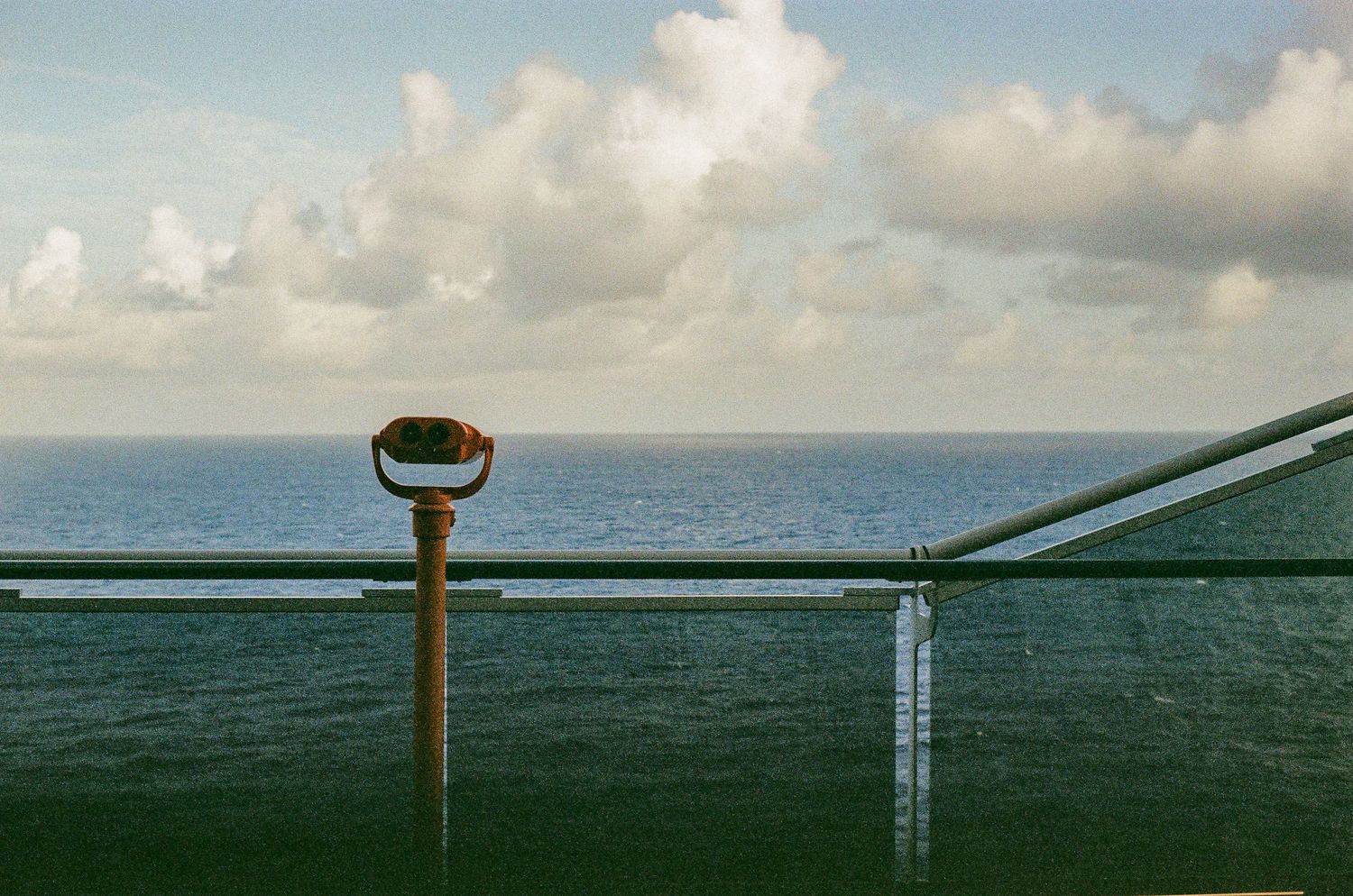
I think what surprised me most when I saw the scan was how much I had fallen in love with the colors. Now, I always do a bit of editing myself after I get scans back from my lab. But how much I had to do here to get an image that worked for me was surprisingly little. While the dominant color is obviously blue, the dynamic range here is pretty insane. From top to bottom, the shades of blue are represented not just accurately, but beautifully too.
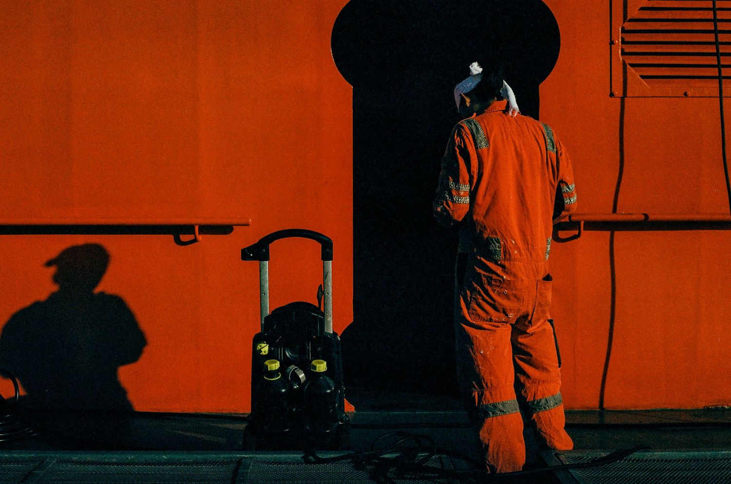
As we made our walk around the deck I found more simple, yet color rich compositions for which to test this roll. Like this one with the crewman in red. He was framed with the shadowed doorway and created a striking contrast with only one dominant color.
However, as each film renders colors differently, I had no idea what to expect when I shot this. I was very surprised to see that despite the different textures between the steel of the ship and the fabric of the uniform, that the reds were nearly identical. This was by design as Virgin uses the same red color for their branding. But I expected them to render differently thanks to how light reflects from different surfaces. But they match almost perfectly here! Again, Pro Image was impressing me with its colors and contrast.
Tones

After our walk we finally had breakfast - Eggs Florentine for me, please and thank you - changed into our bathing suits and hit the pool. We lounged about, sipping on spicy margaritas and making fun of the subjects of our people watching or discussing the abysmal state of American politics or whatever, and when we were tired of the sun sat back on our reclining deck chairs. Steph relaxed and I took the opportunity to walk around and make some photos.
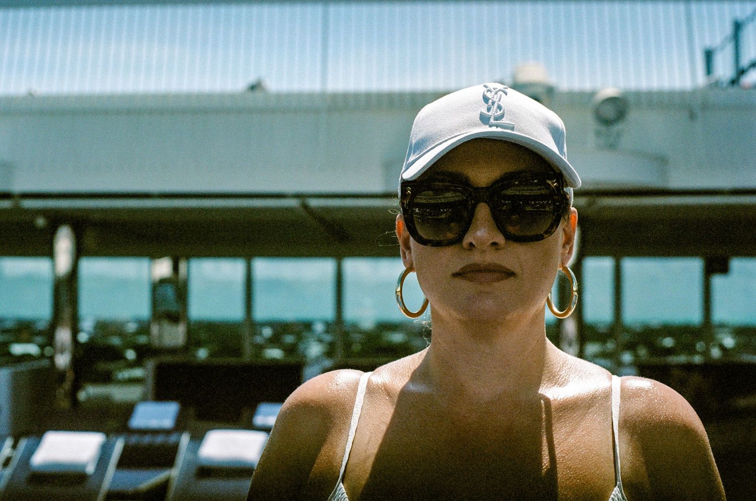
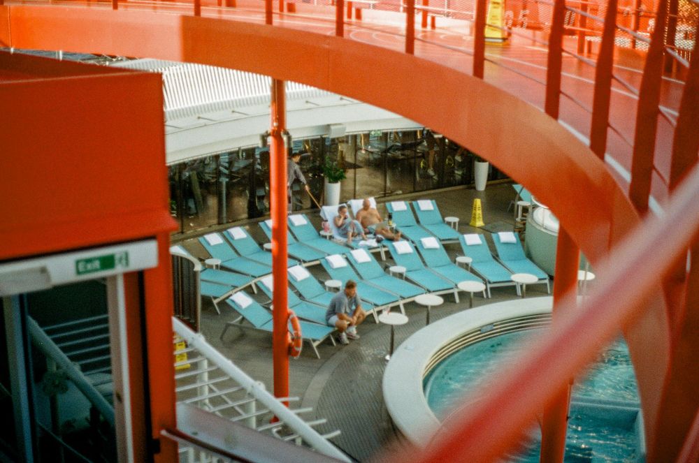
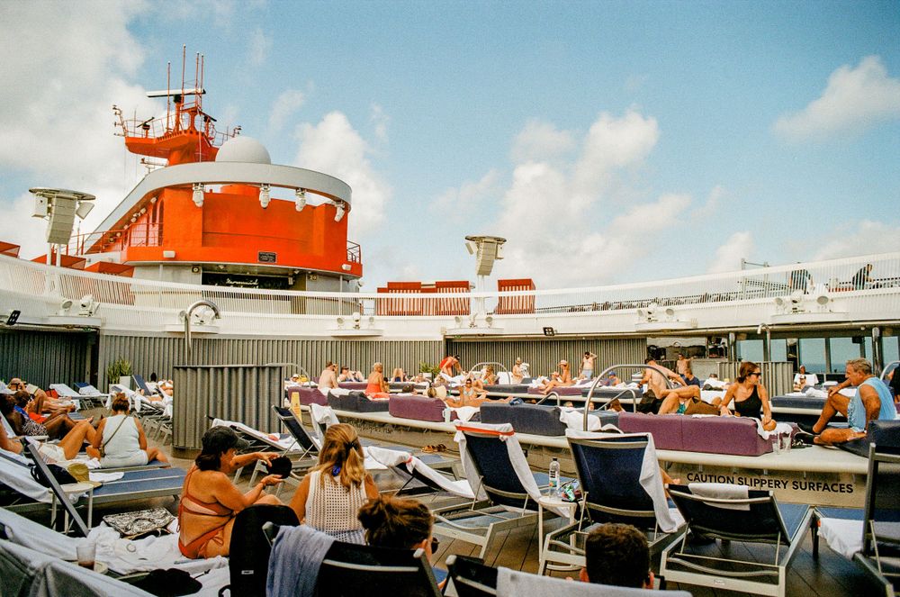
This photograph of the pool and sunbathers is one of my favorites of the trip because of its composition, but also because of its color rendition. There are three main colors here: white, blue, and red. And while each color has its own minute variations within the frame, its almost minimalist in its design. I did not see this at the moment of making the photo, but these three colors unite this photograph. Then we have the skin tones. Each, while varying from sun-kissed to sunburned, is presented uniquely. I will admit that Portra does a (nominally) better job or presenting skin tones (and CineStill 50D better still), but is it enough to justify the price difference? I can't answer that question for you, but for me, I'll say, "maybe?"
Portra Perfect Portraits?

I want to expand on Pro Image for portraiture.
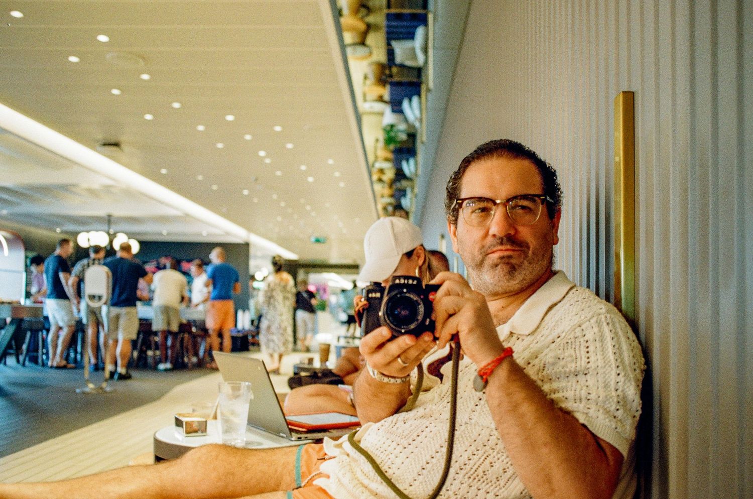
Can you tell which of these two portraits was made with Pro Image 100 and which was made with Portra 160? The lighting conditions are different, one is under soft indoor light and the other harsh sunlight, but I'd say they both render Steph's skin beautifully. If it hadn't been for the fact that I made these two portraits I'd consider it a trick questions and say something like, "Rubbish! They're both Portra, you boob!" But then I'd be wrong, because the portrait of Steph in the red shirt was made with Pro Image.
This is the second time a "lesser" emulsion has left me feeling like Portra isn't all its cracked up to be. Of course, this isn't true. Portra is a great emulsion. I love the 160 speed because it means I can shoot with wider apertures without overexposing. But I do wonder why so few are talking about Pro Image when these are the sorts of results that can be found.
Final Focus
So, what's my point with all this waxing poetic about Kodak Pro Image? Would you believe that I am that excited that I stumbled onto a film that I'm genuinely excited to keep shooting? Yeah, I know how that sounds. But its true.
Steph and I will be back in New York City in about a week. You know what I bought more of for the trip? You guessed it: Pro Image. I've got a few rolls of Portra 160 sitting on my shelf. I've got some Ektar 100 waiting to be exposed. And I've got way too much Tri-X 400 black and white film that is just beginning to be used on some New York Streets.
The thing is, I don't want to shoot them. I want to shoot more Pro Image. And because photography is not logical, resting firmly within the realm of emotions, I guess I'm shooting more Kodak Pro Image 100 very soon.
More Kodak Pro Image 100






All images © 2020-2024 David Ulloa Studio. All rights reserved.